


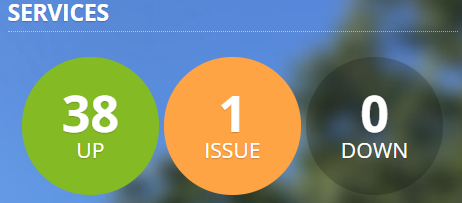
The Service Status website has undergone changes that will help increase functionality and make features more accessible for users of the system.
Accessible Design
MSU IT is committed to reducing barriers that may affect the ability of users to access and consume web content or interact with our systems.
The new design of the Service Status website has received multiple updates for this purpose, including the addition of whitespace surrounding visual elements. Adding whitespace increases color contrast that may aid in readability for those with visual impairments.
The old Services Overview design.

The new, more accessible design.
Functionality Improvements
It is essential to the Service Status site that people can quickly identify critical information as it pertains to them. Numerous improvements were made to accommodate this.
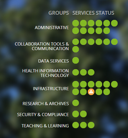
Reduced Group Display
The old Group display, showing all potential groups.

The new design, showing only impacted groups.
In the previous design, all potential groups were displayed regardless of status, with affected services appearing in yellow or red depending on the impact. The new design only displays groups that have services that are currently experiencing an issue and uses both color coding and symbols to indicate the impact to the service to aid in readability.
Planned Maintenance
![The old planned maintenance section, showing no whitespace between the text and background, making it difficult to read. The section consists of a headline that reads, "[Maintenance] VMWare will be unavailable during planned maintenance on 10/21/2021 9:00 p.m. - 11:00 p.m." Below the headline is additional information that says, "On Thursday, October 21, 2021 from 9:00 p.m. to 11:00 p.m., VMWare will be unavailable during planned maintenance." To the right of this, there is an "Affected Services" category, calling out the affected service, which is "Server Hosting."](https://tech.msu.edu/wp-content/uploads/2021/11/Planned-Maint-old.png)
The old Planned Maintenance design, showing one tile.
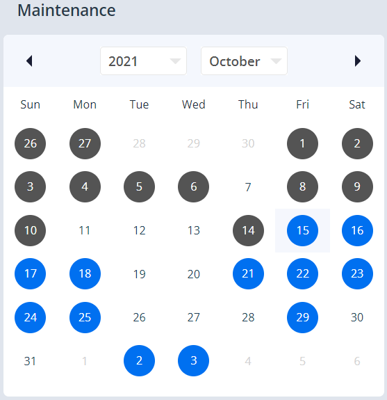
The new design, featuring a calendar format.
The Planned Maintenance segment of the site originally appeared as a series of tiles that could be sorted through, one by one. The new design reconfigures this section into a monthly calendar that allows dates with upcoming maintenance to appear as blue dots on the screen. Dates with completed maintenance will appear with grey dots.
Clicking the blue and grey dots open windows that display the maintenance scheduled on that date in greater detail.
![The window that pops up after clicking on a blue dot in the new Planned Maintenance calendar section. This window shows text that is similar to the text shown on the old version of the planned maintenance section. It reads, "[Maintenance] VMWare will be unavailable during planned maintenance on 10/21/2021 9:00 p.m. - 11:00 p.m. On Thursday, October 21, 2021 from 9:00 p.m. to 11:00 p.m., VMWare will be unavailable during planned maintenance."](https://tech.msu.edu/wp-content/uploads/2021/11/maint2.png)
The pop-up window that shows more details.
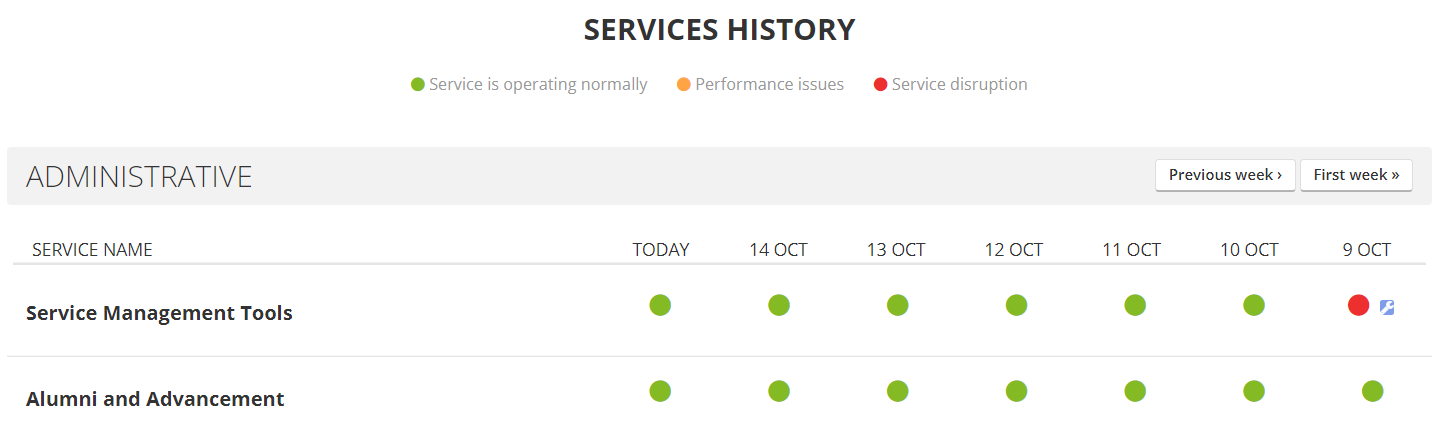
Services History
The Services History section has received multiple updates that enhance usability. The first is a toggle that allows you to filter the display to show only services that have experienced performance issues or disruptions in the range of time that you have selected.
The old Services History design.
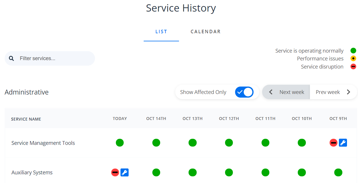
The new design, featuring List and Calendar displays, and a “Show Affected Only” toggle.
The display is also able to switch between list and calendar formats using a toggle at the top of the section.
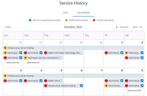
The Calendar format of the new Services History section.
We’re proud to introduce these improvements that enhance accessibility while also making the Service Status website easier to navigate and understand for users across the university.
You can subscribe to alerts from the Service Status site by pressing the “Subscribe” button in the top right of the page. You can then subscribe to alerts through the following mediums:
- Phone (text alerts)
- MS Teams (use these instructions)
For questions or concerns about the redesign of the Service Status website, contact the Service Management Office at ITServices.ServiceManagementOffice@msu.edu.